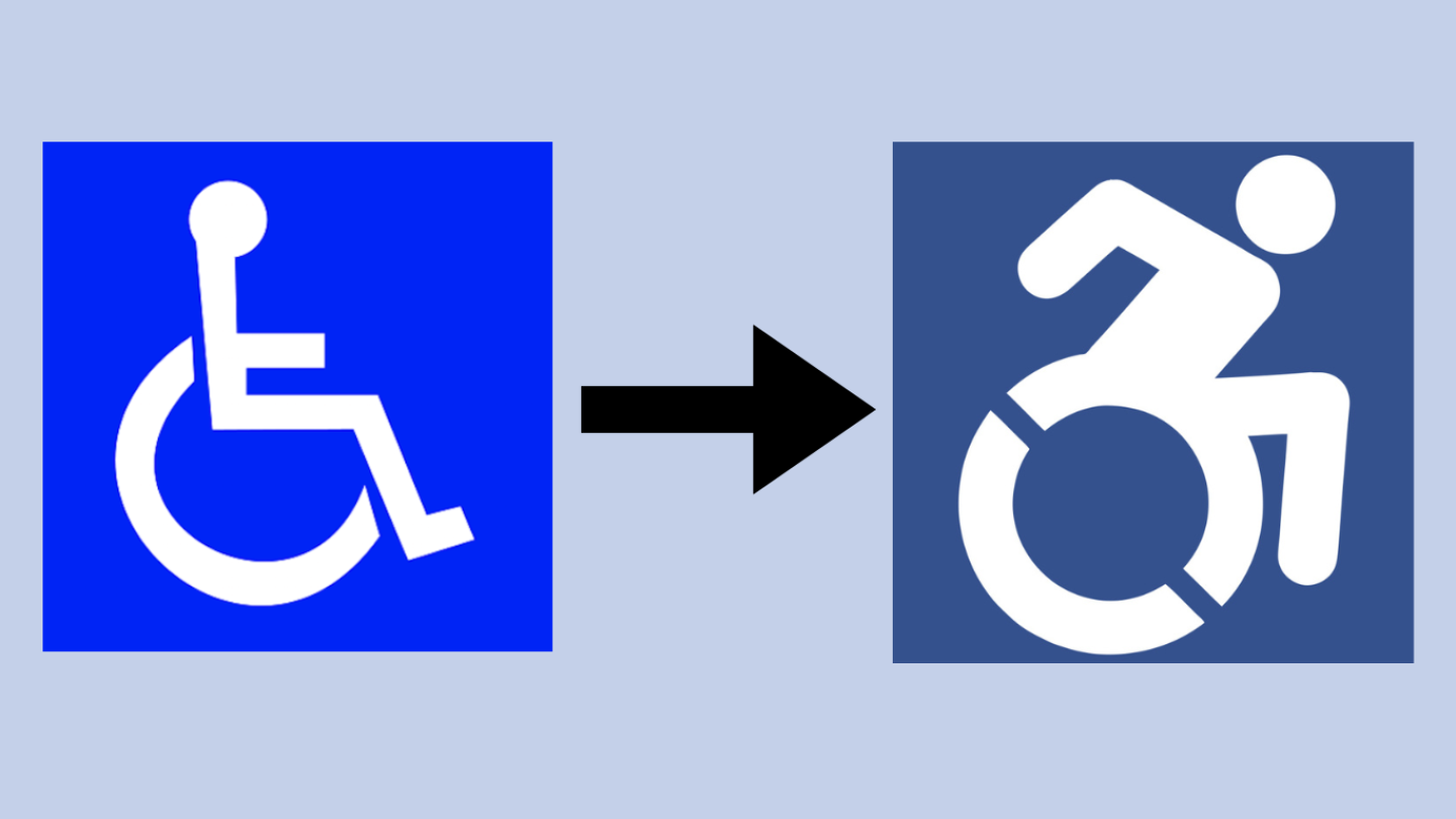
The original International Symbol of Access, designed in the 1960s by Susanne Koefoed. Its provisions are historic and profound. But its rectilinear geometry doesn’t show the organic body moving through space, like the rest of the standard isotype icons you see in public space. And the new, final icon in white on blue, to keep to the standard color scheme of the original. Now there’s just one wheel, but with two cutouts to emphasize its motion and make it easy to stencil.
Graphic made by Heide Borgonovo using images from accessibleicon.org

Change the Sign and the Public Perception of Wheelchair Users

Share
The original International Symbol of Access, designed in the 1960s by Susanne Koefoed. Its provisions are historic and profound. But its rectilinear geometry doesn’t show the organic body moving through space, like the rest of the standard isotype icons you see in public space. And the new, final icon in white on blue, to keep to the standard color scheme of the original. Now there’s just one wheel, but with two cutouts to emphasize its motion and make it easy to stencil.
Graphic made by Heide Borgonovo using images from accessibleicon.org
Change the Sign and the Public Perception of Wheelchair Users
Copy

In Cambridge and Malden, Massachusetts, the image depicted on parking signs reserved for people with disabilities is slowly being replaced, from the familiar white stick figure in a wheelchair, to something more dynamic.

A campaign to do likewise is underway around western Mass.

Erin Murray said she plans to go city by city to advocate repainting or replacing signs with a new more dynamic image, and instead of the words “Handicap Parking,” she wants to see the words “Reserved Parking.”

“It really is paint and a different stencil,” Murray said.

In 2024 in Springfield Murray, who is an occupational therapist and professor at Western New England University, was the energy behind some signs being changed in front of a clinic on campus.

Her motivation, she said, is to change the public perception of people in wheelchairs.

“So that people know that individuals with disabilities are active participants in society,” Murray said. “They’re not passive or stationary.”

While the physical change to the signs might be simple, local and maybe lawmakers will need to weigh in on legislation or ordinances.

Murray started a petition last year to show officials she said — there’s interest in updating the logo.

To date she said, she’s been in contact Northampton and Springfield.

More than a decade ago, The Accessible Icon Project came up with their version of a stick figure in a wheel chair— in motion. It’s one of several alternative designs, created with the idea of replacing the dominant stick figure in a wheel chair.

Connecticut lawmakers took up legislation several years ago that would change the wheelchair logo when signs around the state needed to be replaced, or new spots became available in parking lots.

According to “New York Dynamic Accessibility Symbol Laws Compliance Resource Bulletin,” in 2014 the state of New York approved similar legislation.

This story was originally published the New England News Collaborative.

After Providence police officers were filmed at the scene of an ICE arrest over the weekend, Police Chief Col. Oscar Perez held a press conference to defend his department’s actions
The Wilbury Theatre Group’s FRINGEPVD fills Providence’s Valley Arts District with two weeks of daring performances, visiting artists, and inclusive, community-driven events
Plaintiffs hope for a speedy injunction to free the money ahead of the rapidly approaching school year
Choking claims the lives of more than 4,100 Americans who are 65 or older every year
The Fall River Fire Department first responded to the Gabriel House of Fall River assisted living facility after 9 p.m. Sunday